Component Category
Tue, Jul 5, 2022
Read in 2 minutes
Category là component được tái sử dụng rất nhiều trong app Bán Lại.
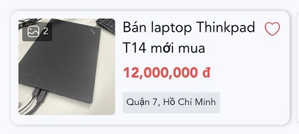
Thẻ Category được thiết kế để hiện thị những thông tin căn bản và cần thiết nhất mà người dùng quan tâm, như là hình ảnh, tiêu đề bài đăng, giá, địa chỉ sản phẩm. Ngoài ra còn có 1 icon trái tim để người dùng có thể lưu nhanh bài viết này vào danh sách quan tâm của mình.
Đối với những component loại thẻ, chúng ta sẽ dùng component Card mà ZMA cung cấp
<div onClick={handleViewDetail}>
      <Card style={{ padding: 0 }}>
        <Box
          flex
          flexDirection="row"
          p={2}
          m={0}
          className="border-color-nl700"
          style={{
            position: "relative",
            height: "120px",
            borderBottom: border ? "0.5px solid" : "",
            borderRadius: border ? "" : "8px",
            boxShadow: border ? "" : "1px 0px 4px rgba(0, 0, 0, 0.25)",
          }}
        >
          <Box
            width={102}
            height={102}
            m={0}
            p={0}
            flex
            justifyContent="center"
            alignContent="center"
            style={{ position: "relative" }}
          >
            <img
              src={product.images[0].url}
              style={{
                objectFit: "cover",
                width: 102,
                height: 102,
                borderRadius: 4,
              }}
            />
            <CustomImage product={product} />
          </Box>
          <Box style={{ flex: 1 }} my={0}>
            <Box p={0} m={0} style={{ height: 48 }}>
              <Title
                size="xsmall"
                style={{
                  marginRight: 16,
                  overflow: "hidden",
                  display: "-webkit-box",
                  WebkitLineClamp: 2,
                  WebkitBoxOrient: "vertical",
                  wordBreak: "break-word",
                }}
              >
                {product.title}
              </Title>
            </Box>
            <Title size="xsmall" className="text-color-rl300" bold>
              {moneyFormat(product.price)}
            </Title>
            <Box
              p={1}
              m={0}
              className="bg-color-lg700"
              style={{
                borderRadius: 2,
                width: "fit-content",
              }}
            >
              <Text size="xxxsmall" style={{ marginBottom: 0 }}>
                {product.district}, {product.city}
              </Text>
            </Box>
          </Box>
          { isShowHeart !== 0 && (
          <Box m={0} style={{ position: "absolute", right: 8, top: 8 }}>
            <HeartIcon
              isLiked={product.isLiked}
              handleLikeUnlike={(e) => {
                e.stopPropagation();
                return handleLikeUnlike(product);
              }}
            />
          </Box>
            )}
        </Box>
      </Card>
    </div>
Ở đây bọn mình cũng thiết kế 1 component CustomImage để có thể cân đối với thẻ Category, ban có thể xem qua component này tại link này